10 Die Print Tips for Creating Stunning Printed Materials
Creating stunning printed materials takes skill and knowledge in the art of Die Print. This process combines creativity with technical expertise, resulting in eye-catching products. Each project requires careful planning and execution. The right techniques can elevate your work and engage your audience effectively.
Understanding Die Print is essential for achieving professional results. The choice of materials, colors, and finishes plays a vital role. Even small details can make a significant difference. For example, incorporating unique textures can enhance visual appeal and tactile experience. However, one must balance creativity with practicality.
While striving for perfection, it's important to accept that not every print will go as planned. Mistakes can occur, prompting reflections on techniques and strategies. Learning from these experiences is valuable for growth. By focusing on the craft of Die Print, you can create memorable pieces that resonate with viewers. Embrace both the successes and challenges in your journey.
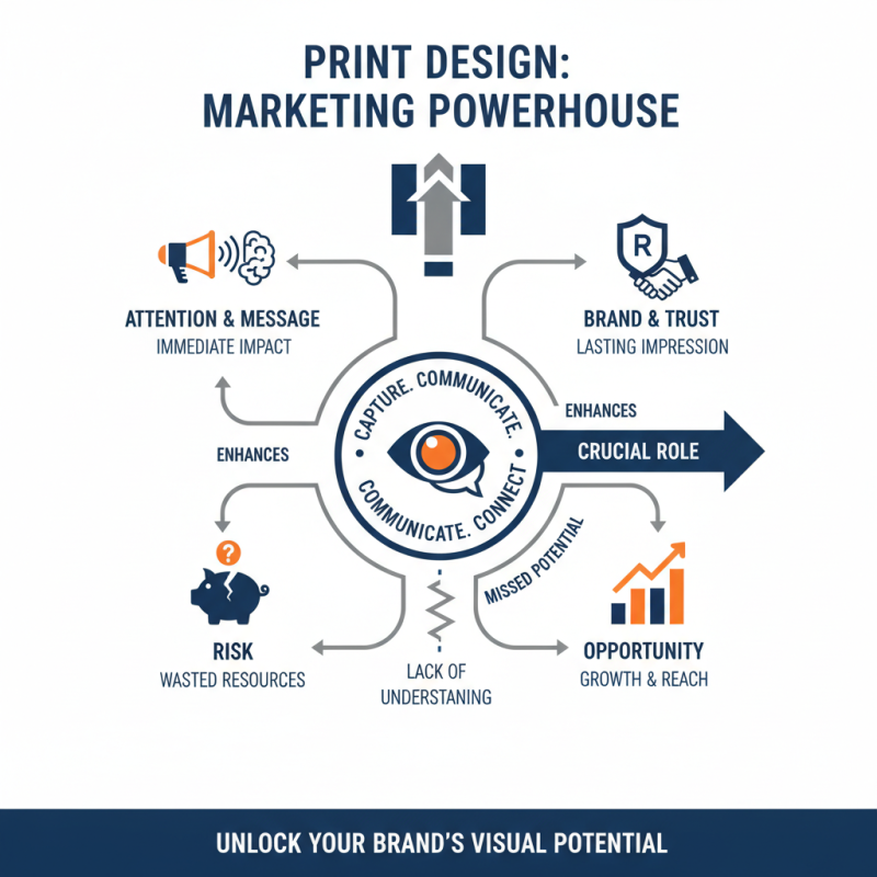
Understanding the Importance of Print Design in Marketing
Print design plays a pivotal role in marketing success. It can capture attention and communicate messages effectively. A well-designed printed material leaves a lasting impression on potential customers. This visual impact can enhance brand recognition and trust. Yet, many overlook the nuances of print design. A lack of understanding can lead to wasted resources and missed opportunities.
Effective print materials must align with overall branding. Colors, fonts, and images should reflect the brand's identity. However, not all designs hit the mark. Sometimes, what looks good on screen may not translate well to print. This misalignment can confuse consumers. Testing different designs can prevent this pitfall. Adjusting layouts or color schemes can yield better results.
Details matter in print design. High-resolution images ensure clarity, while appropriate paper quality enhances tactile appeal. However, it’s crucial to know when less is more. Overly complex designs can overwhelm viewers. Keeping layouts simple can improve comprehension. Misjudging a target audience can lead to ineffective messaging. Regular feedback from real users can refine the design approach and increase effectiveness.
Choosing the Right Paper and Material for Your Project
Choosing the right paper and material for printed projects significantly impacts the final product's quality. According to a report from Smithers Pira, around 80% of a printed material's perceived value comes from its paper. Selecting paper that matches the project's purpose is crucial. It can enhance colors, textures, and overall aesthetics. For example, coated papers often yield vibrant results. Conversely, uncoated papers give a more organic feel. Many designers underestimate this aspect.
When considering material, think about weight and finish. Heavier weights add a sense of durability and professionalism. Yet, lighter weights can be more economical for bulk projects. A survey from the Printing Industries of America noted that nearly 67% of print buyers prioritize paper quality in their purchasing decisions. The decision affects printing methods as well. Not all printers perform well on all paper types. Test prints are invaluable for evaluating how your chosen material interacts with ink.
Reflect on the environmental impact of your choices too. Sustainable materials are gaining attention. Many consumers now prefer eco-friendly options. A study from Nielsen reports that 73% of millennials are willing to pay more for sustainable goods. This trend affects how brands choose their materials. It presents a challenge: balancing quality with sustainability. Such considerations can make a significant difference in your printed project's effectiveness and appeal.
10 Die Print Tips for Creating Stunning Printed Materials - Choosing the Right Paper and Material for Your Project
| Paper Type |
Weight (gsm) |
Finish |
Best Uses |
Printing Technique |
| Coated Paper |
200 |
Glossy |
Brochures, Flyers |
Digital, Offset |
| Uncoated Paper |
120 |
Matte |
Stationery, Notebooks |
Digital, Offset |
| Cardstock |
300 |
Silk |
Business Cards, Postcards |
Offset |
| Recycled Paper |
150 |
Natural |
Eco-Friendly Projects |
Digital, Offset |
| Synthetic Paper |
250 |
Waterproof |
Outdoor Materials |
Digital, Offset |
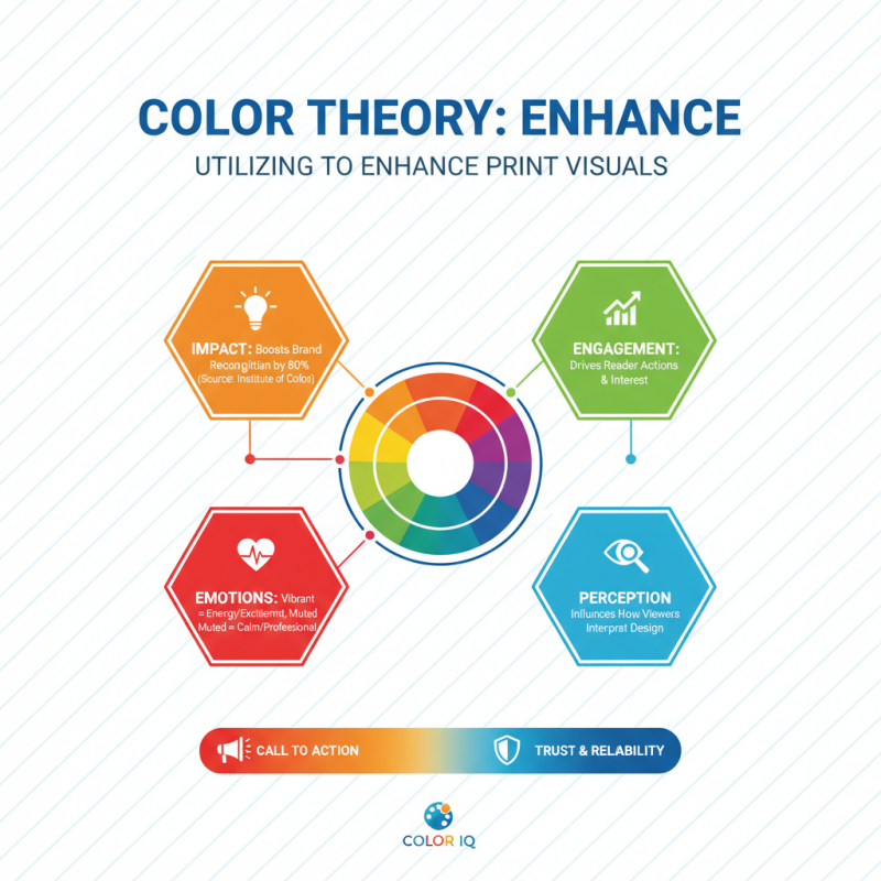
Utilizing Color Theory to Enhance Print Visuals
Color theory plays a vital role in creating visually appealing printed materials. It influences how viewers perceive designs. Research from the Institute of Color suggests that color can impact brand recognition by up to 80%. Effective use of color enhances engagement and can drive a reader's actions. For example, vibrant colors can evoke emotions, while muted tones may convey professionalism.
Understanding color harmonies is essential. Complementary colors create contrast, making visuals pop. Analogous colors provide a more cohesive look, guiding the eye smoothly across printed materials. Yet, designers sometimes overlook the psychological effects of color. For instance, blue tends to instill trust, while red can trigger urgency. Choosing the wrong color palette may miscommunicate your message.
Despite the abundance of resources on color theory, many designers struggle with practical application. They may use too many colors, creating chaos instead of clarity. Additionally, poor contrast can make text difficult to read. Designers must continually evaluate their color choices. Noticing how customers react to different color schemes can lead to better outcomes and refined designs.
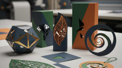
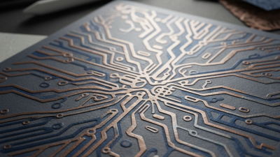
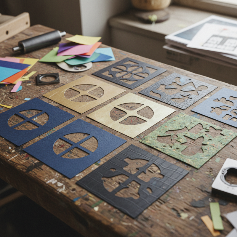
Incorporating Textures and Finishes for a Unique Touch
Textures and finishes can elevate your printed materials from ordinary to extraordinary. When designing, think beyond standard paper. Explore options like linen, felt, or even metallic surfaces. Each texture adds depth and engages the senses. A tactile experience can resonate more with your audience.
Consider using
spot UV coating on printed areas. This technique highlights specific elements while leaving the rest matte. It creates a striking contrast. Adding
foil stamping can give your designs a touch of luxury. Gold or silver accents catch the eye and draw attention to key messages.
Don't overlook the importance of
consistency. While textures add uniqueness, they should align with your brand identity. Ensure that your finishes complement your overall design. Testing various combinations can lead to unexpected results. Sometimes, what seems like a perfect match may fall short. Reflect on how each method interacts with your designs and audience perception.
Optimizing Layout and Composition for Maximum Impact
Optimizing layout and composition is crucial for effective printed materials. Start with a clear focal point. This could be the main message or image. Use contrasting colors and bold fonts to draw attention. Make sure that eye-catching elements do not overwhelm the design. Balance is key. Each part should complement the other, creating harmony across the layout.
Consider using grid systems for alignment. It helps in organizing elements neatly. However, strict adherence can hinder creativity. Sometimes, breaking the grid can lead to unique designs. Incorporate white space intelligently. It allows the eyes to rest and highlights important information. A cluttered layout can confuse readers and dilute your message.
While experimenting, don’t shy away from mistakes. Sometimes, an imperfect design sparks innovation. Reflect on previous projects for insights. Analyze feedback on layouts you felt uncertain about. Use criticism as an opportunity for growth. Embracing imperfections can lead to more authentic, engaging printed materials.
Print Design Optimization: Key Factors Impact on Quality
 Contact immediately

 Contact Phone
 Contact Email